
































Feedback
AI Excel Chart Generator

Turn Excel data into clear, professional charts instantly with AI. Free, fast, and easy to use.

See It in Action

Explore shared Excel Chart Generator examples. Tap any card to open the result in a new tab.

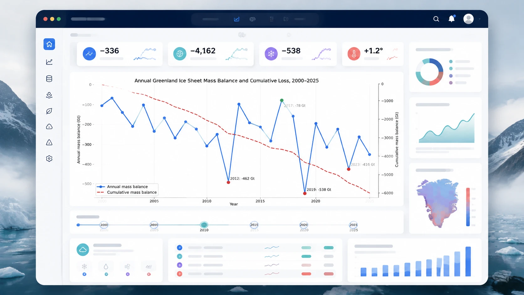
Trend & Anomaly Analysis
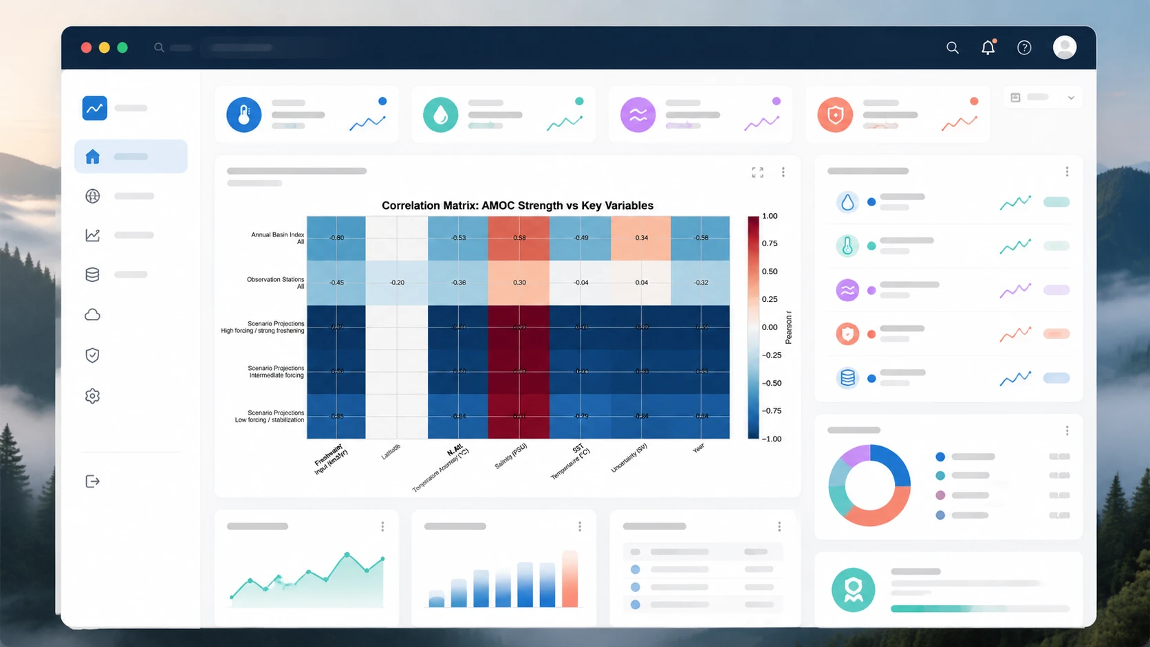
Correlation & Drivers
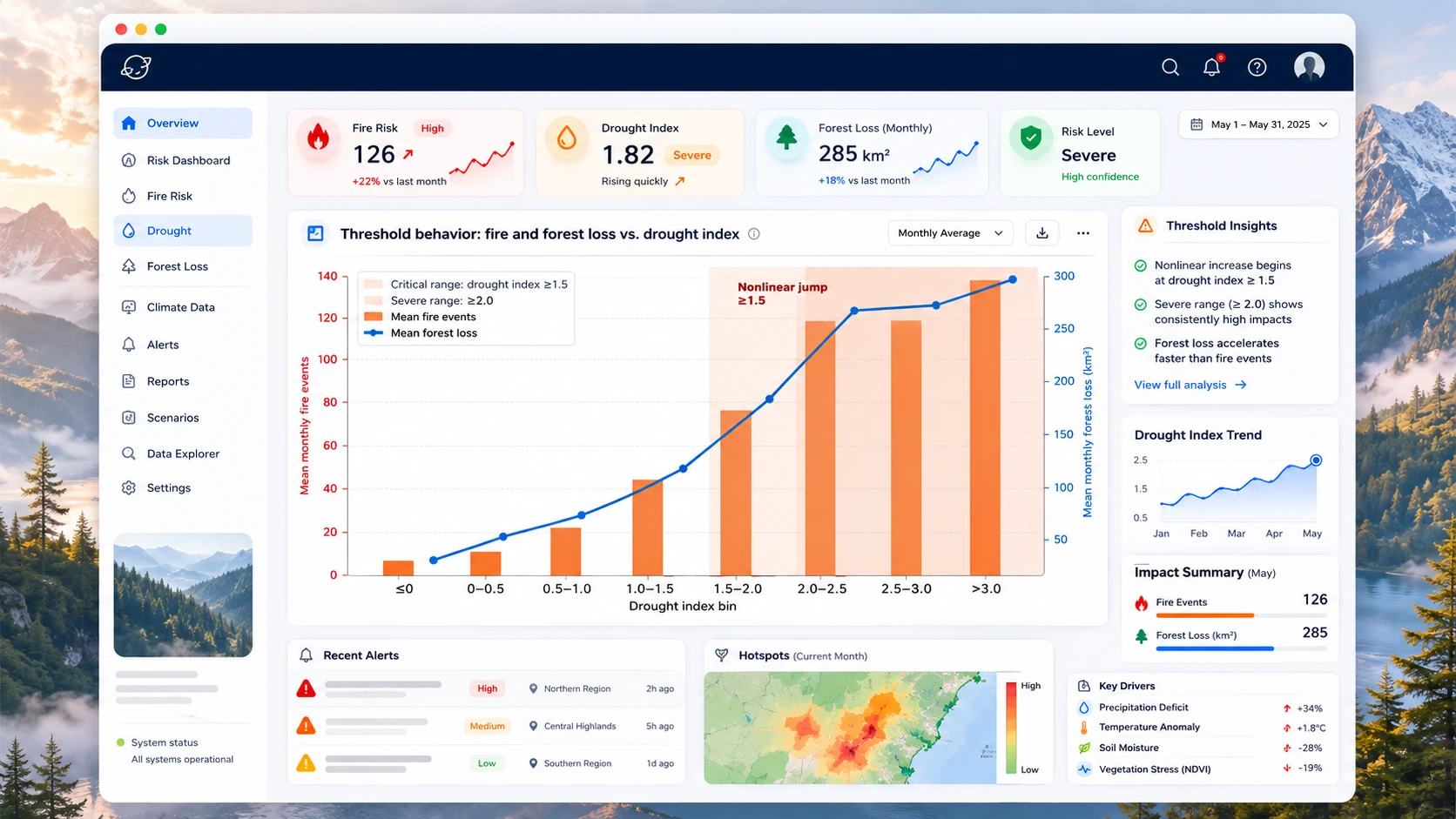
Threshold & Risk Detection
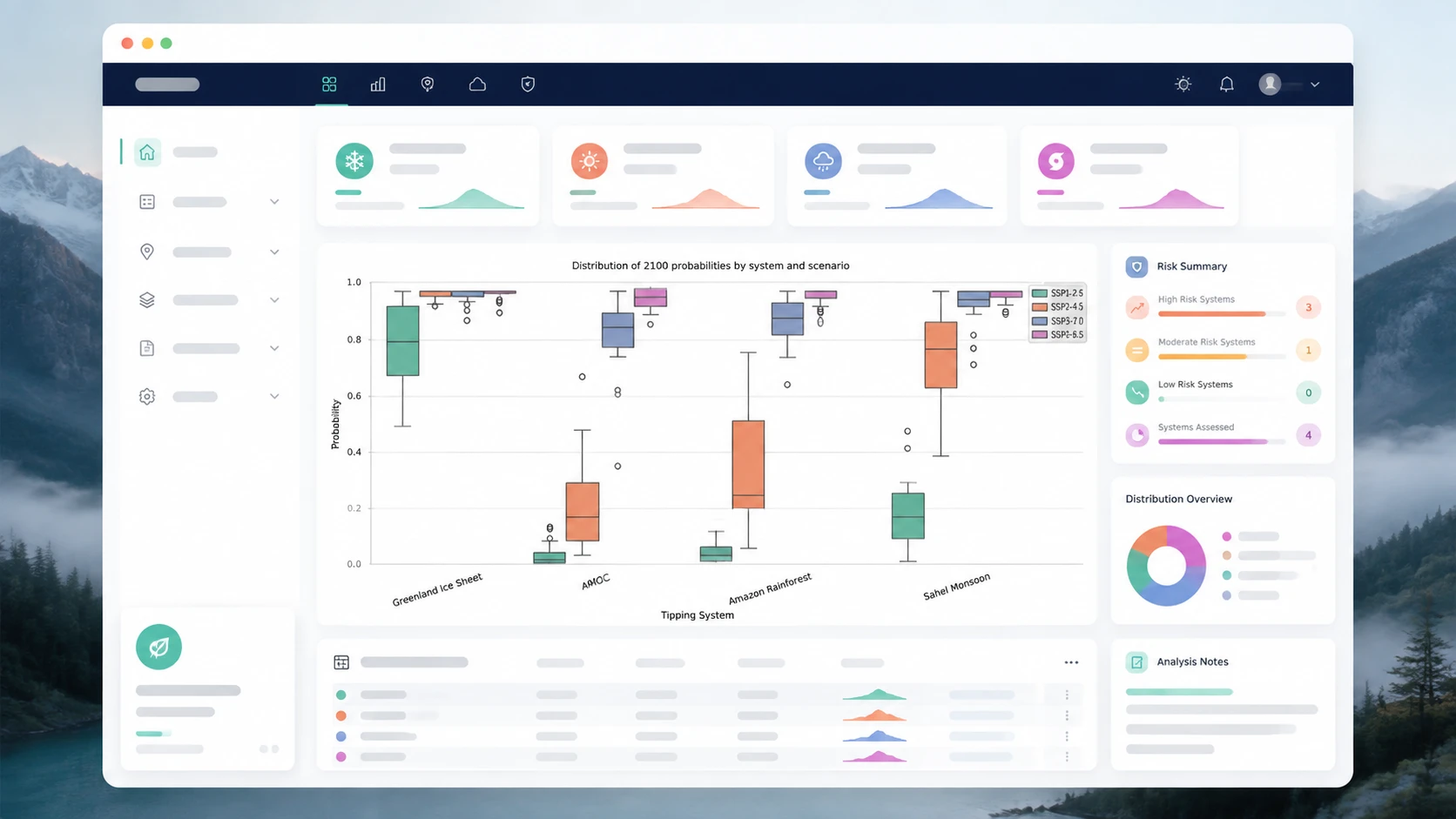
Model & Scenario Comparison
Evidence Synthesis

Excel Chart Generator - AI Excel Charts & Graphs Free Online

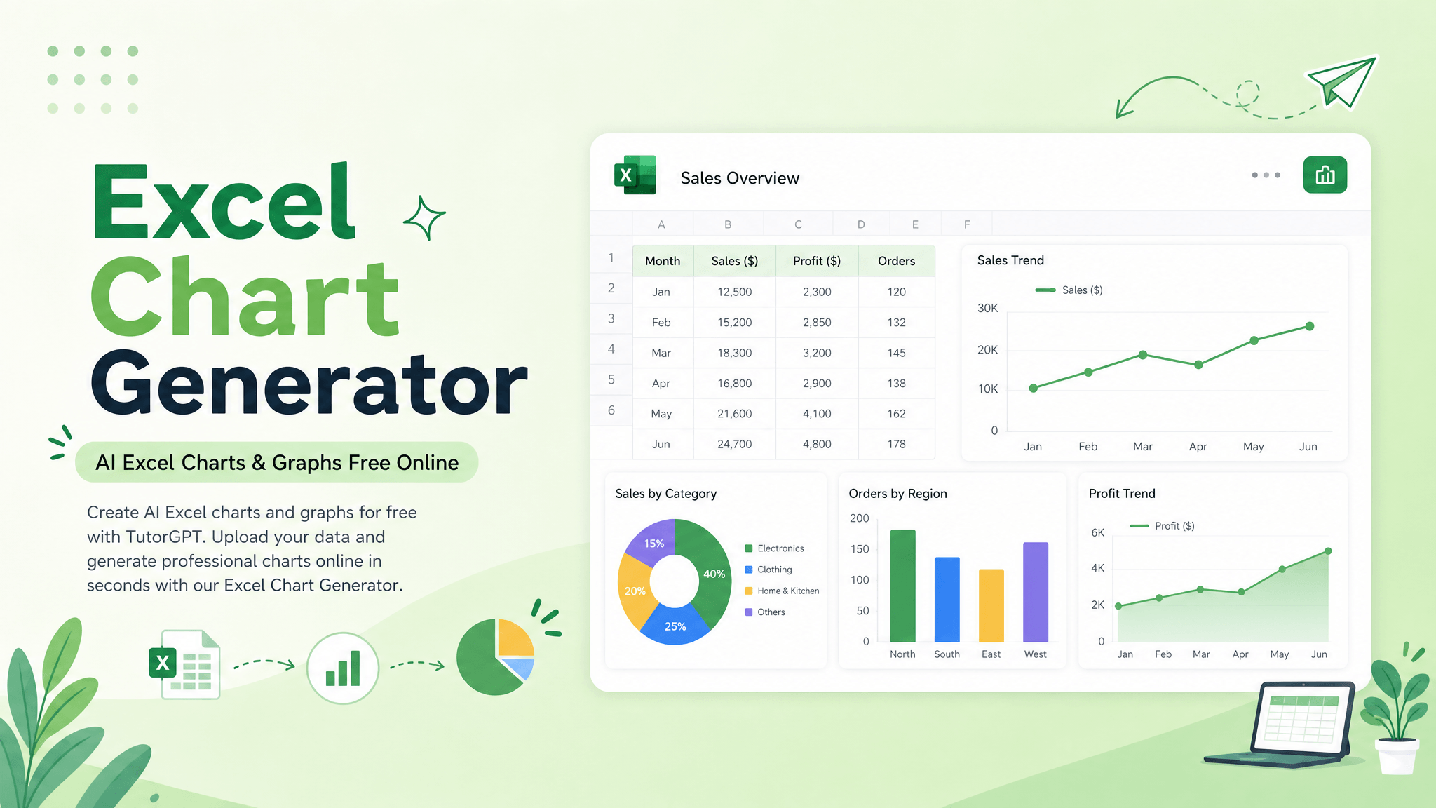
Create AI Excel charts and graphs for free with TutorGPT. Upload your data and generate professional charts online in seconds with our Excel Chart Generator.

Excel Chart Generator - AI Excel Charts & Graphs Free Online

Trusted Worldwide

Built on reliable AI technology for effective learning and homework support. Trusted by learners, educators, and professionals worldwide.

Dublin
Atlanta
Klien
Davis
Capistirano
Everrette
Buffalo
Denver--public-school
Appleton
Greenville
HCS
Seattle-Public-Schools
Northside
Irvine
Norfolk
PCS
TheSteppingStonesGroup_black
Napperville
Logo24
YouTube
Princeton
Dublin
Atlanta
Klien
Davis
Capistirano
Everrette
Buffalo
Denver--public-school
Appleton
Greenville
HCS
Seattle-Public-Schools
Northside
Irvine
Norfolk
PCS
TheSteppingStonesGroup_black
Napperville
Logo24
YouTube
Princeton
Dublin
Atlanta
Klien
Davis
Capistirano
Everrette
Buffalo
Denver--public-school
Appleton
Greenville
HCS
Seattle-Public-Schools
Northside
Irvine
Norfolk
PCS
TheSteppingStonesGroup_black
Napperville
Logo24
YouTube
Princeton

Why does Excel turn a simple chart into a maze of clicks?

You already have the data — the frustrating part is turning it into a chart that actually makes sense. Choosing the right chart type, selecting the right data, fixing axes and series, and cleaning up the final design can take far longer than it should. With messy or large spreadsheets, one wrong selection can turn a useful insight into a confusing mess. Excel Chart Generator handles the setup for you, so you can move from raw data to a clear visual without fighting every menu.

Why does Excel turn a simple chart into a maze of clicks?

What Can Excel Chart Generator Do?

Find the Right Chart for Your Data

Stop guessing whether your data needs a bar, line, pie, or scatter chart. Excel Chart Generator analyzes your spreadsheet structure and recommends the visualization that best fits your data, so you can highlight trends, comparisons, or relationships without trial and error.

Find the Right Chart for Your Data

Handle Messy Data Without Manual Chart Setup

Skip the endless work of selecting ranges, mapping axes, and configuring data series. The AI Excel Chart Generator automatically identifies relevant columns, assigns X and Y axes, and organizes multiple series — even when your spreadsheet is large, wide, or far from perfectly clean. For deeper analysis, use Excel Data Analyzer to uncover trends and patterns first.

Handle Messy Data Without Manual Chart Setup

Create Presentation-Ready Charts in Seconds

A chart that technically works is not necessarily a chart you want to show. Excel Chart Generator turns your data into clean, readable visuals with polished titles, labels, and layouts, making them easier to drop into reports and presentations. Pair your charts with AI Report Generator to turn the results into a complete report.

Create Presentation-Ready Charts in Seconds

What Makes Our Excel Chart Generator Stand Out

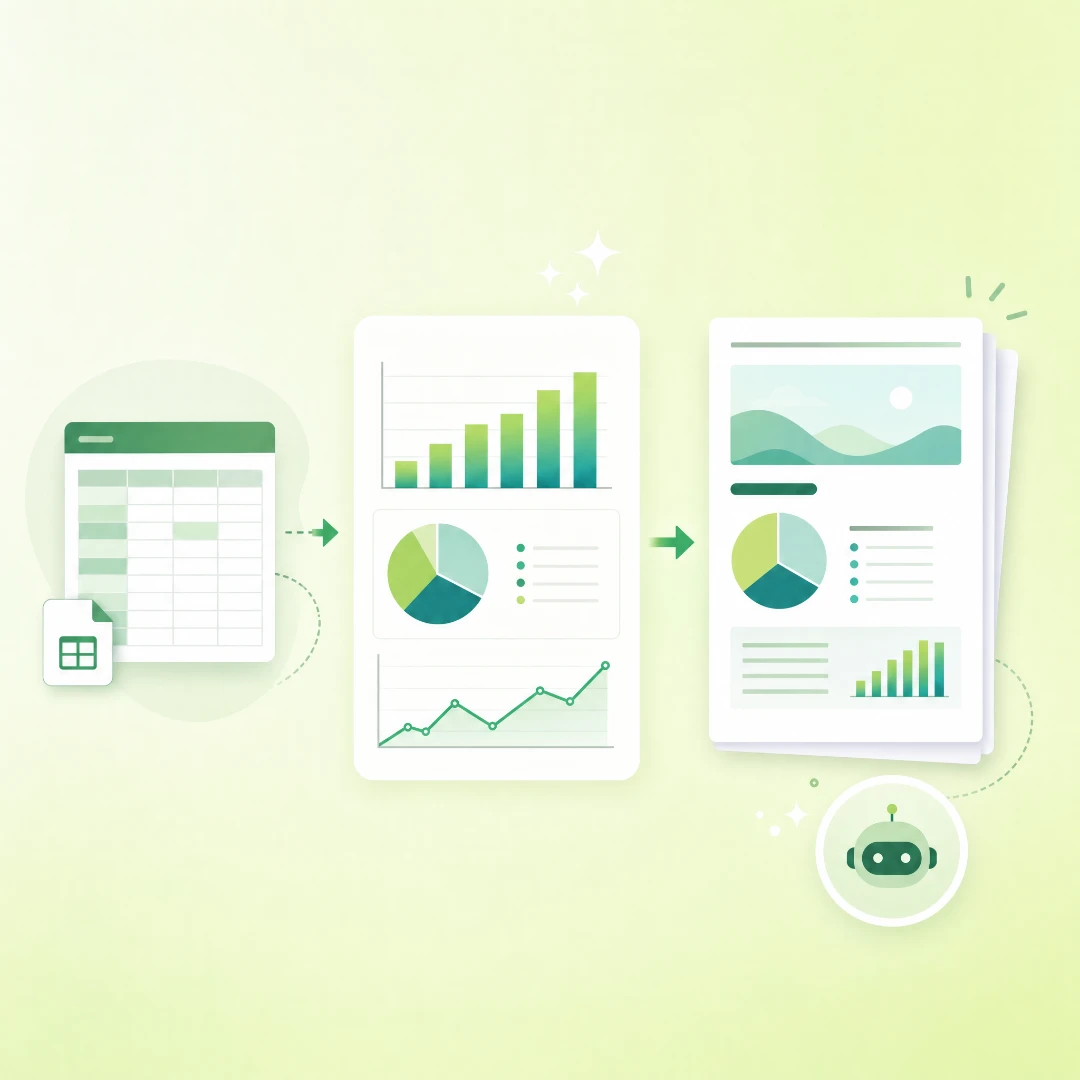
Upload your spreadsheet and let AI turn it into charts that actually explain your data.

Work with Excel & CSV Files Without Extra Cleanup

Upload Excel or CSV files directly and let the Excel Chart Generator work with your existing spreadsheet data, so you can start generating charts without rebuilding your dataset first.

Let AI Agents Handle the Data Work for You

AI Agents process your uploaded data, identify relevant fields, and prepare the information needed for chart generation — taking care of repetitive data-handling steps behind the scenes.

Match Data With the Chart That Explains It Best

The Excel Chart Generator intelligently connects your data patterns with suitable chart types, helping you choose a visualization that makes trends, comparisons, or relationships easier to understand.

Use Cases of Excel Chart Generator

Sales & Business Reporting

Sales

Turn raw sales spreadsheets into clear charts for revenue, orders, conversion rates, and monthly performance, making weekly or monthly reports faster to prepare and easier to understand.

How to Use the Excel Chart Generator

Step 1: Give Your Data and Tell Us What You Need

Step 1: Give Your Data and Tell Us What You Need

Upload an Excel or CSV file and describe the chart you want in plain language.

Step 2: Let AI Agents Work Through the Data

Step 2: Let AI Agents Work Through the Data

Your AI Agent reads the file, analyzes the data, and builds the right chart for your request.

Step 3: Review the Results and Insights

Step 3: Review the Results and Insights

Review the generated chart and the short AI explanation to understand key patterns in your data.

Turn Your Spreadsheet Into Your Next Big Insight

No data skills required. Let the Excel Chart Generator handle the messy work and turn your Excel or CSV data into charts you can actually understand and use.

What Users Say About Our Excel Chart Generator

Rachel Thompson avatar

Rachel Thompson

Sales Operations Manager

I’m usually preparing sales updates under a deadline, so I don’t have time to fight with chart settings. I uploaded a spreadsheet with revenue, order volume, and regional performance, and the Excel Chart Generator quickly turned it into clean Excel charts I could use in our Monday review. It saved me from second-guessing the chart type and let me focus on the numbers that mattered.
Emily Carter avatar

Emily Carter

Graduate Research Assistant

Honestly, Excel charts used to make me nervous. I had survey results for a university project, but I wasn’t sure how to compare the groups clearly. With the AI Excel Chart Generator, I just uploaded the file and explained what I needed. The chart it suggested made the results much easier to understand and present.
Daniel Brooks avatar

Daniel Brooks

Digital Marketing Specialist

Every week, I deal with campaign data, traffic sources, leads, conversion rates, and monthly numbers. Before using the Excel Chart Generator, I had to clean up the CSV before I could even think about making a chart. Now I can describe the question I want answered and get readable charts much faster. It easily saves me about 30 minutes each reporting cycle.
Michael Anderson avatar

Michael Anderson

Customer Insights Analyst

For me, the value is not just that it creates a chart. It helps decide which chart actually makes sense. I was analyzing customer retention data and kept switching between line and bar charts. The Excel Chart Generator looked at the structure of the data, chose a clearer format, and explained the reasoning, which made the output feel much more useful.
Sophie Williams avatar

Sophie Williams

Financial Analyst

I had a quarterly expense spreadsheet with too many categories and several months of figures packed into one file. The AI Excel Chart Generator helped turn that messy sheet into focused Excel charts for our management deck. The result was much easier to present, and the main cost comparison became obvious without walking everyone through rows of numbers.
James Wilson avatar

James Wilson

Operations Analyst

I work in spreadsheets all day, but chart formatting still feels like a time sink. Ranges, labels, axes, legends — it always takes longer than it should. I tried the Excel Chart Generator with a weekly operations dataset, described the trend I wanted, and got a usable chart without spending another hour adjusting every little thing. That’s exactly the kind of AI help I need.

FAQs About Excel Chart Generator